Lukas reviewed the digital font files the two groups had produced and started to carefully expand the character set. While adding the basic characters for a bold version it became clear that certain characteristics of the Roman would have to be adjusted. At this point the workload began to grow considerably as more material was found, more characters were drawn and more glyphs needed to be modified, as well as the fact that both groups had yet to start designing the italic.
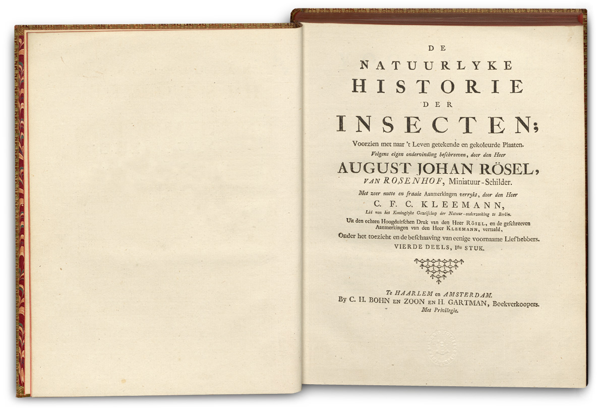
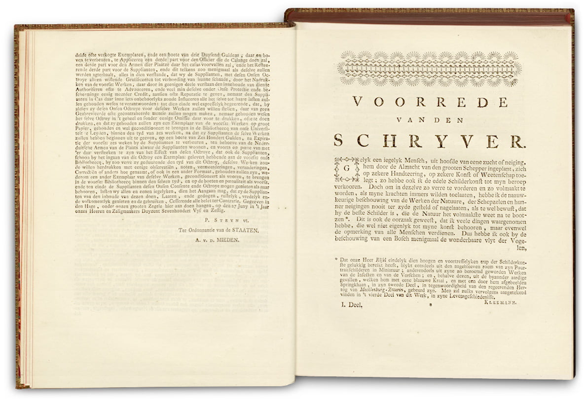
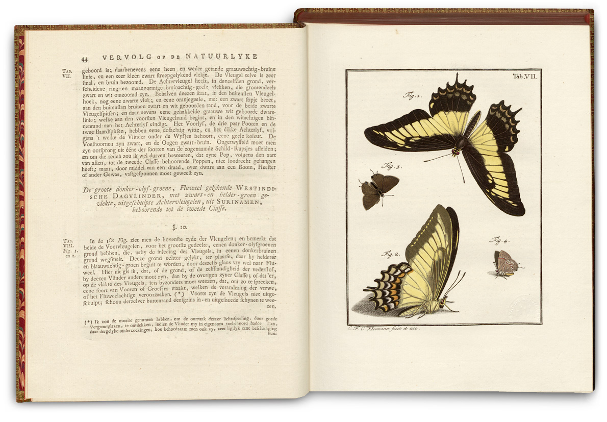
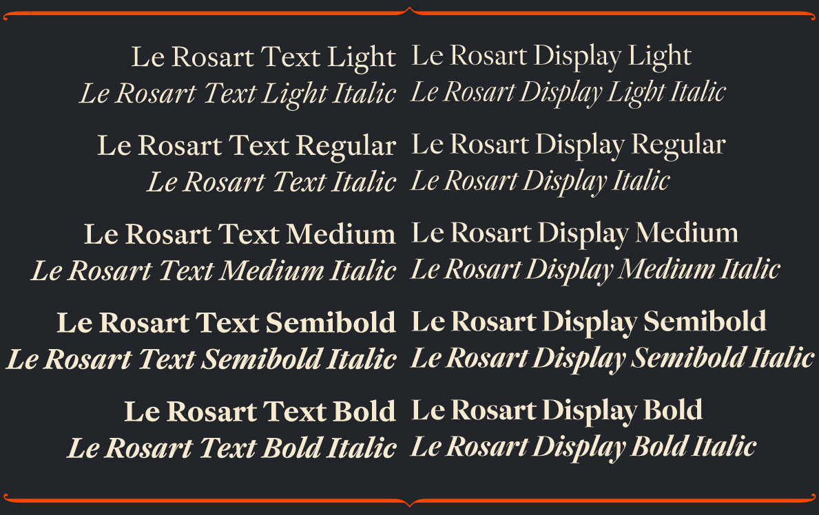
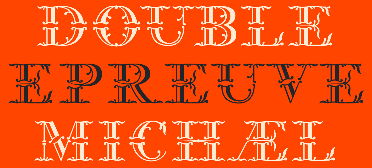
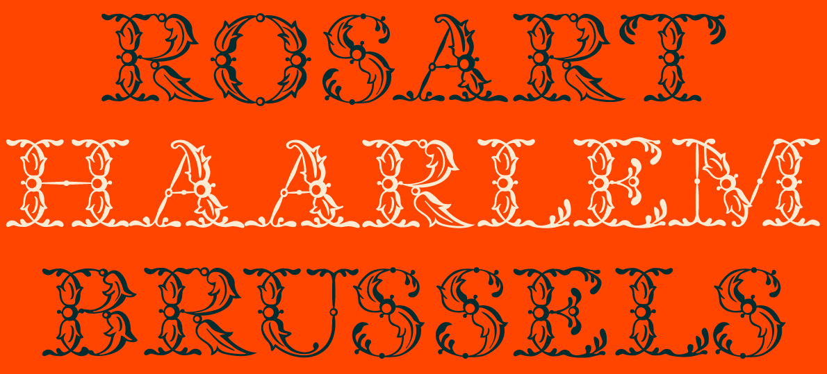
While gradually expanding the weights and character set of the text and display versions, the group searched for additional archival material to support their designs. Michel and Walda were fortunate enough to have access to the original punches at the Museum Plantin-Moretus and the Noord-Hollands Archief (Haarlem, the Netherlands), while Lukas explored recently digitized titles from various sources including the library of the Museum Plantin-Moretus. A key reference in this next stage was August Johan Rösel van Rosenhof’s ‘De Natuurlyke Historie der Insecten’, a rare example of Rosart’s printing types for reading sizes and a beautiful specimen in its own right.
August Johan Rösel van Rosenhof, ‘De Natuurlyke Historie der Insecten’, Haarlem by C.H. Bohn en H. de Wit, 1765–1788.
Images: Collectie Stad Antwerpen, Erfgoedbibliotheek Hendrik Conscience.
Lukas adds: ‘writing about the type-design process is difficult, as you work you continuously make spontaneous decisions without documenting them. At a certain stage you can see a form and a direction for the typeface and the process can only really be understood by comparing the outcomes with the original source material.’
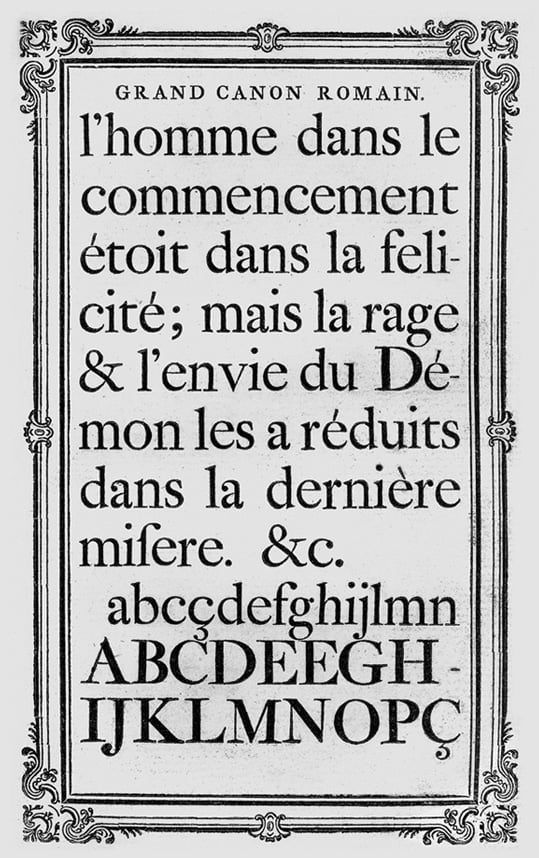
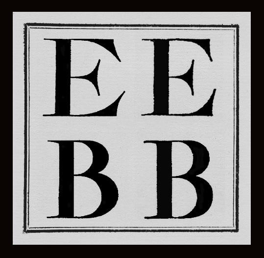
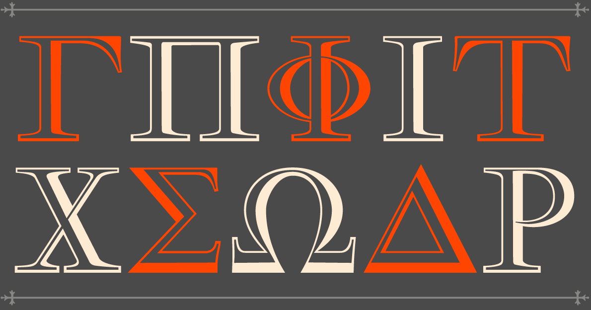
In the Grand Canon Romain, for example, the capital letters are relatively large and much bolder than the lowercase. This was something quite fashionable in types during the Baroque period. As this kind of discrepancy would look erroneous in a contemporary typeface, the weight of the capitals was reduced to better match the lowercase. However, one advantage of the apparently uneven weight distribution in the source material was that it helped to imagine what more bolder weights should look like, at least for the capitals.
In the eighteenth century bold weights of type had not yet been invented, during this period to emphasise texts or darken words, black-letter types were used. It goes without saying then that Rosart never intended for his types to be bold and this made the creation of the bold weights all the more difficult as Lukas was adding weight to intricate counters and darkening areas within the anatomy of the type. Some shapes that read clearly in a lighter weight do not work well when made bold and with the expressive and playful forms of the Baroque, especially in the italics with their relatively steep angle and expressive curves, one quickly runs into problems.
Maintaining the finesse of the original model in bolder weights (while keeping counters and apertures open enough for use at smaller sizes) was a serious challenge. Because the italic forms are slightly more condensed than the roman, the darker and bolder certain shapes become, the more difficult it is to draw them in coherence with the original. Some letter-shapes, for example the italic ‘z’ (see Petit Canon Italique No. 78 for example), are rhythmic and complex, and it is hard to bolden them without losing some of the elegance and character Rosart intended.
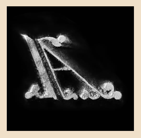
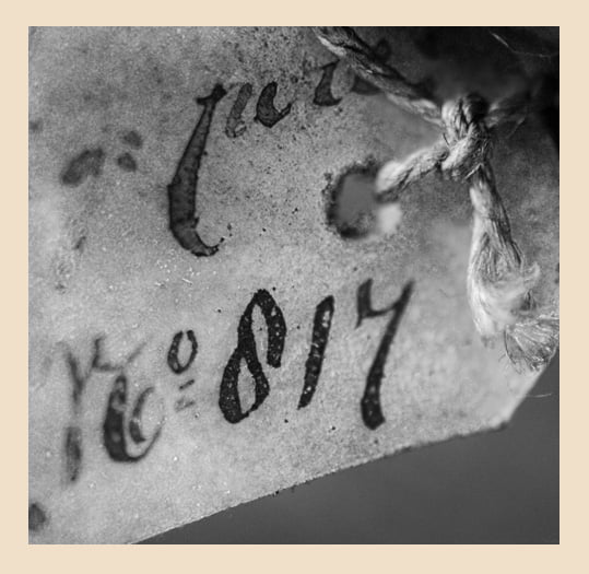
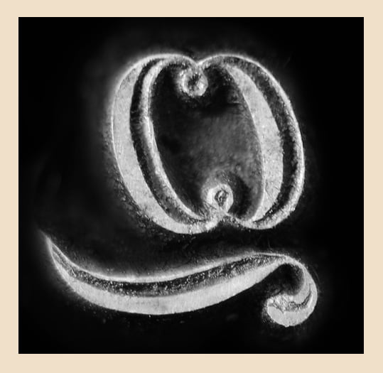
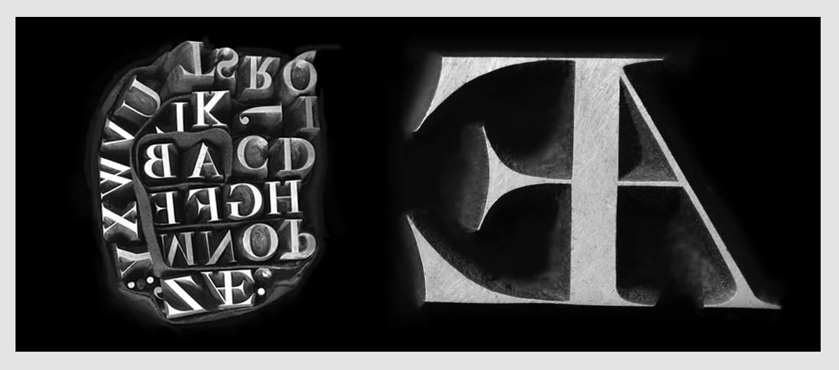
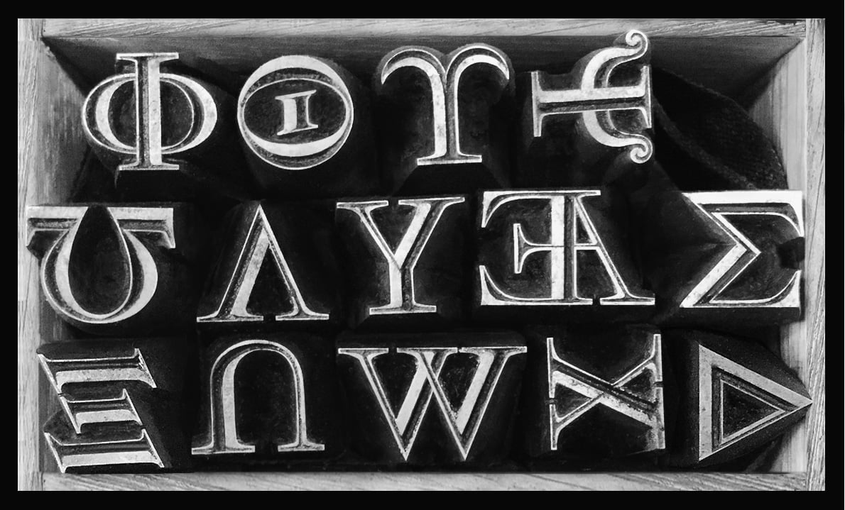
All too often details are faded in the historical prints due to the technical limitations of the period, the quality of the paper, the consistency of the ink or the letterpress itself and the myriad of variables in the time that passes from then to now. In the art of reviving type, it is the punches that often offer unique insight into not only the tacit skill of the cutter, but the crucial decisions and nuances within the designs, intentional or not. The team had the good fortune to have access to the original punches cut by Rosart and to study these in detail and take photographs to work from.
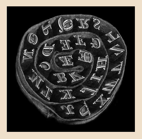
Original punches of the Titling Capitals cut by Rosart – Photos: Walda Verbaenen.
Some details had to be modified either to avoid dark spots or to improve the distinctiveness of certain characters in smaller sizes. One example is the shape of the h of the italic cuts. In the original it has a ball terminal on the inside. (see Petit Canon Italique No. 785, digitized from ‘Fonderies de caractères […]’). This shape tends to look like lowercase letter b, which can be confusing especially when used in small sizes, to mitigate this for contemporary readers the new italic text version ‘h’ is based on the letter ’n’, making the shape more open and is easily distinguishable. For the sake of historical accuracy the original shape of the h (with the ball terminal) is included in the digital fonts as a stylistic alternate.
Petit Canon Italique No. 785 from the 1767 Ploos van Amstel brothers Specimen.
Petit Canon Italique No. 785 from the 1752 Rosart Specimen.
Petit Canon Italique No. 785 from the 1780 J. de Groot Specimen. – Joh. Enschedé en Zonen, ‘Fonderies de caractères […]’, 1908.
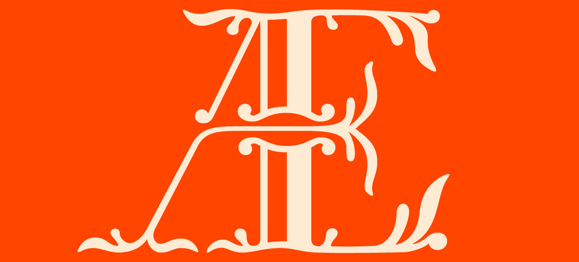
Developing the italics presented its own unique design challenges. The spacing of the asymetrical shapes of uppercase A, V and W for example – usually the white space between letters would be evened out in order to get homogeneous patterning and when text is set in all caps these asymetric shapes create white gaps at certain letter combinations, which can't be compensated by kerning. This was something the team had to get accustomed to and accept as a stylistic peculiarity of Rosart. The whole revival process revealed several similar challenges, sometimes the designers simply had to make compromises or accept inconsistencies, but it is exactly these incongruities that define the character and charm of Rosart’s types.
«Within the process of digitization, inconsistencies in the original design became more obvious. Automatically the question arose as to whether to keep these quirks or to harmonize them for a more consistent look. It seemed only right to consult other sources to see if these inconsistencies were intentional or merely the technical mishaps and snags of printers or compilers.»
As Lukas puts it ‘sometimes these references led to even more confusion, like when you found a totally different design of a certain shape in another specimen. Basically the whole revival process was accompanied by the comparisons and careful considerations of how far things can differ from the original without changing the spirit of the design... a design which seemed to evolve or devolve depending on which specimen we looked at.
In the interest of contemporary typographic standards, certain things like the length of the serifs in the Roman had to be standardised while trying to maintain the overall appearance of the original material. This is also the case in the italic, the expressiveness of varied slopes and different angles of lettershapes had to be slightly reduced in the new version for a more consistent and contemporary look.’
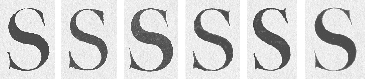
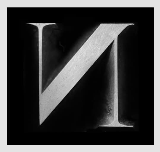
Collection of various S shapes enlarged to the same size. The style of the serifs and the width differ. The large diversity of the shapes sometimes made it much harder to decide in which direction the digital version should take.
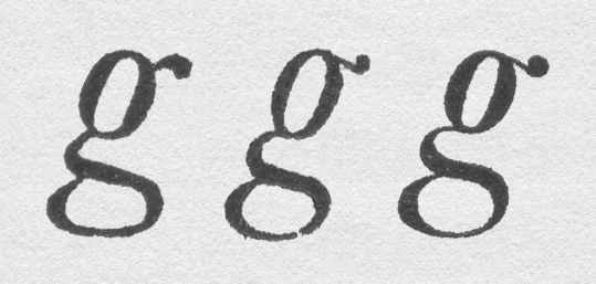
Different shapes of letter g – in this example its apparent Rosart didn’t always stick to a specific model. Left: Le Parangon Italique No.788 (Ploos) – 1784/1790 Right: Le Petit Canon Italique No. 785 (De Groot) - 1780.
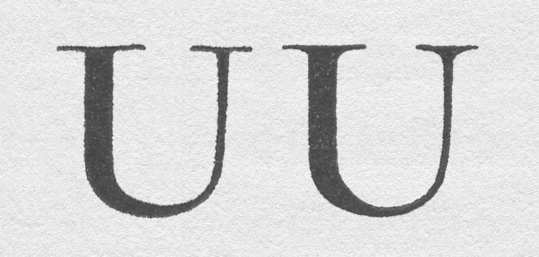
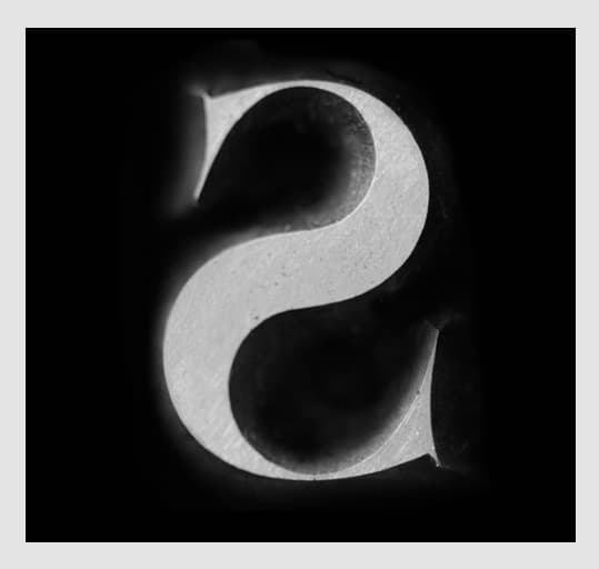
Comparison of two different capital letters U. Notice the difference of the transition of the stems to the serifs. Left: an almost sharp connection. Right: a rather soft transition.
In summary it can be said that when designing a revival typeface it isn't always helpful to look at a vast quantity of archive research. From a design perspective, this project is a good example of how historical material, while always informative, can limit design and even contradict itself at times. At exactly the point where the designers assumed that they had seen all of ‘the Rosart’, something new popped up, which looked different again. This seemed counterproductive at times, because it questioned all progress and put doubt around early design decisions. Generally, it seems best to adhere to a certain specimen as the main reference, rather than using too many at the same time. Nonetheless, the project provided a unique insight into not only the types of Rosart in general, but also how he evolved certain ‘base’ models for roman and italic in new directions throughout his career.
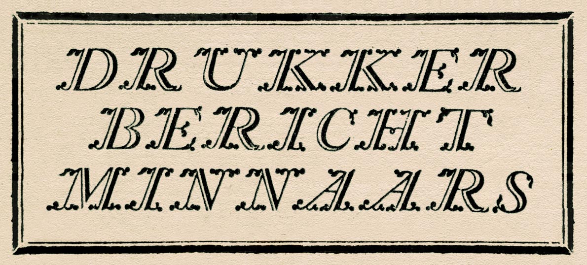
«One of the most fascinating parts of Rosart’s work are probably his playful flourished alphabets.»
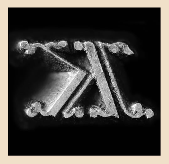
Original punches cut by Rosart – Photos: Walda Verbaenen.
(Collection Enschedé, Noord-Hollands Archief, Haarlem).
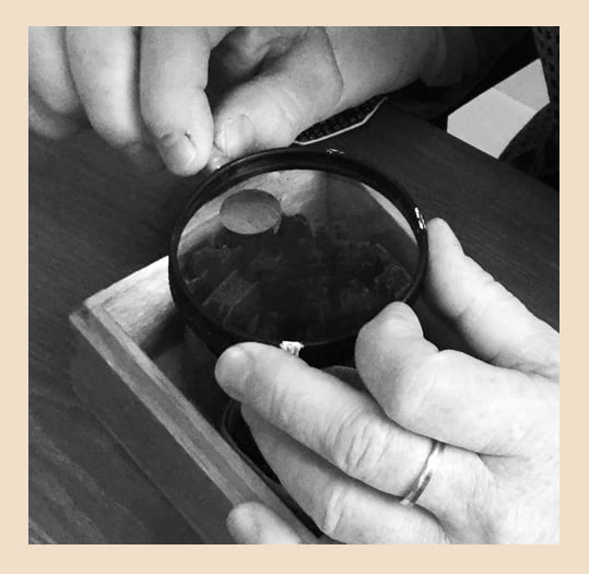
Walda and Michel, who digitized some of Rosart’s Flourished Alphabets, have done an in-depth research into the historical material of Rosart as a basis for their designs. They dived into the collections of Museum Plantin-Moretus and at the Noord Hollands Archief / Collection Enschedé. Thanks to this opportunity, they could have a look at the original punches and printed material and captured everything (photo / scan) which proved to be very valuable to their research and to make decisions about the shapes of the serifs.
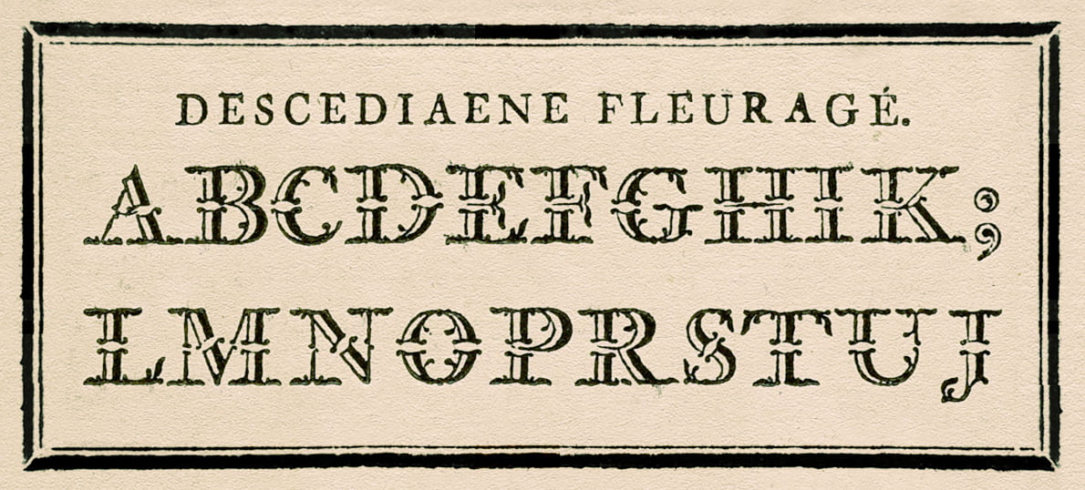
Descediaene Fleuragé cut by Jacques-François Rosart, Specimen of the Widow Decellier, 1779.
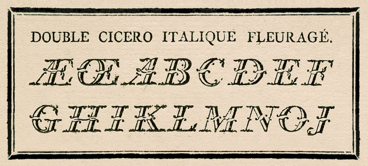
Double Cicero Italique Fleuragé cut by J.F. Rosart, Specimen of the Widow Decellier, 1779.
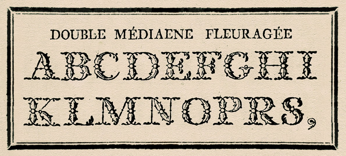
Double Mediaene Fleuragée cut by Jacques-François Rosart, Specimen of the Widow Decellier, 1779.
Rosart’s Two-line Small Pica Shaded & ornamented Inclined Capitals, Collection Enschedé, 1978.
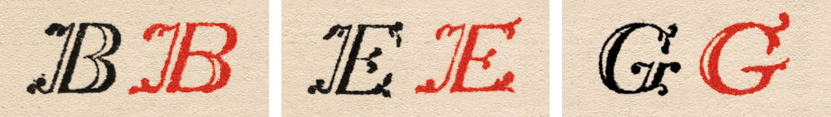
prev next «Next to Rosart’s work, comparisons were made between the flourished capitals of Rosart and Fournier, which clearly shows the inspiration and rivalry of punchcutters during the 18th Century.»
Comparison between Rosart (Black) and Pierre Simon Fournier (Red).
The four chosen series of punches of the Flourished Capitals were carefully photographed in detail. Other sources for this research were various specimens, in particular the ‘Typespecimen of J.F. Rosart, 1768’, ‘Proef van letteren, Enschedé 1773’, Épreuve des Caracteres de la Fonderie de la Veuve Decellier, 1779’, and ‘Typefoundries of the Netherlands, Enschedé, 1978’. Very helpful was also Charles Enschedé's report in ‘Fonderies de caractères […]’.
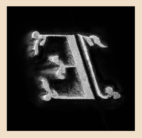
«Beside the Flourished Capitals, Rosart designed and cut also very intriguing Open Capitals with Roman and Greek letters and a large number of Titling Capitals.»
The punches and type specimen of these capitals in the Collection Enschedé were examined by Michel and photographed by Walda during their several visits.
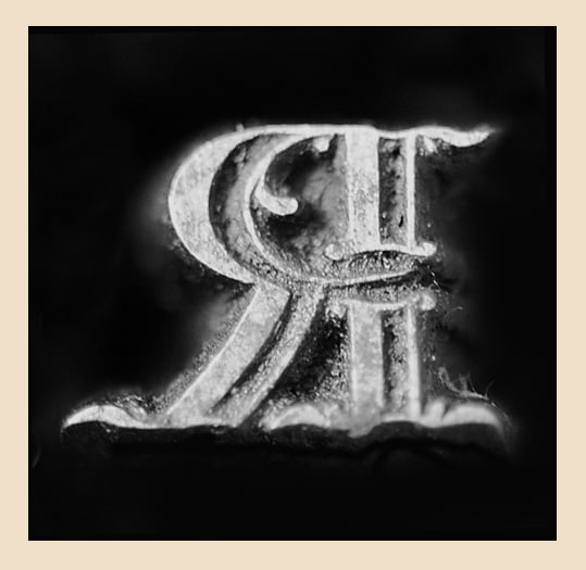
Original punches of the Titling Capitals cut by Rosart – Photos: Walda Verbaenen.
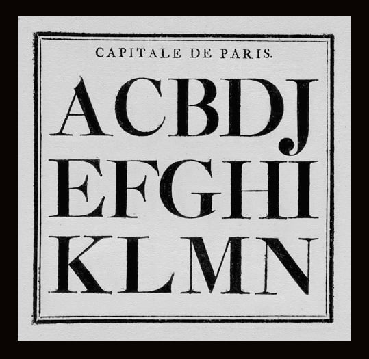
Capitale de Paris – Rosart’s Titling Capitals.
Comparison of letters Rosart cut in Haarlem (left) and several years later in Brussels (right).
Open Capitals punches cut by Rosart, Collection Enschedé. Photo: Walda Verbaenen.
Work on the open and titling capitals is still in progress. For this, Michel is examining the type specimen and punches. By comparing the flourished capitals with the titling capitals made in Haarlem and Brussels, Michel found out that the flourished capitals were created on the framework of the titling capitals.
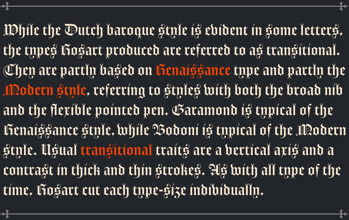
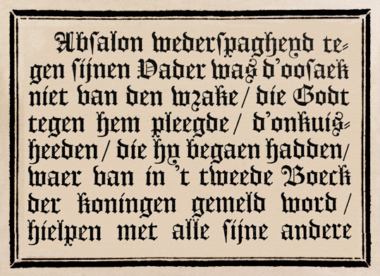
«Besides various classical text and display styles Rosart has also cut a few Blackletter types. At his time these were, at least in the Low Countries, called Flamande or Duijts.»
Black-Letter typefaces were probably developed especially for the German market, which the name «Duijts» suggests. Duijts is an archaic version of the dutch word “duits”, which means “deutsch” (German).
The revival of the Textura was much easier than the revival of the text and display types, because the model Rosart followed for the Black-Letter types was much clearer. There are only a few printed specimens and very few in larger sizes, which made the research and revival process pretty straightforward. The only difficulty was the lack of certain shapes to extend the characterset. In order to get an impression of how missing characters could appear, some printed specimens of Fleischmann’s Black-Letter were used as reference.
Within the process it became obvious that it would make sense to create two versions, one for large applications with fine hairlines and a high stroke contrast and a lower contrast version for smaller sizes.
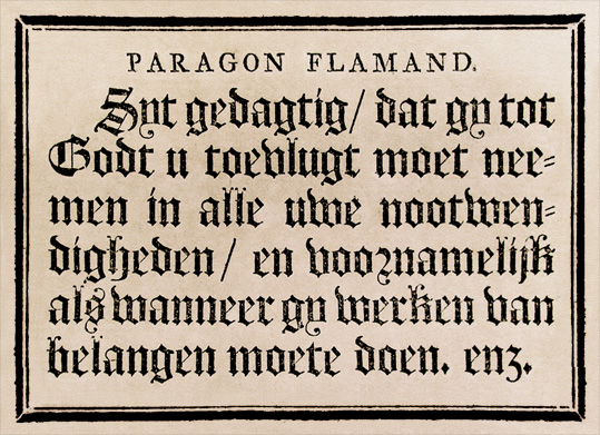
Paragon Flamande – Black Letter / Textura – No. 900. Specimen of the Widow Decellier, 1779.
Text Flamande – Black Letter / Textura – No. 822. Specimen of the Widow Decellier, 1779.
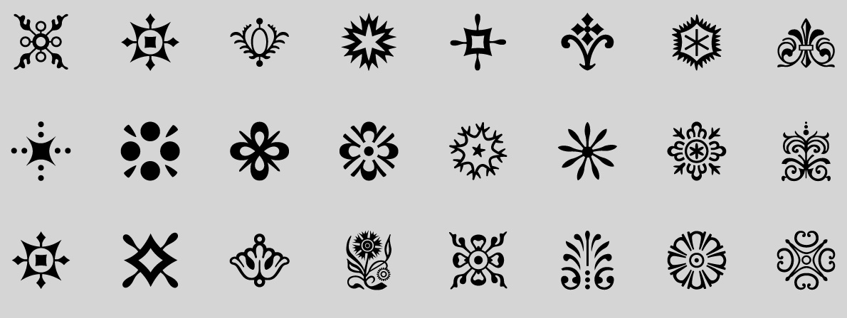
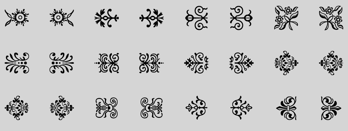
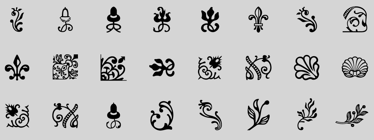
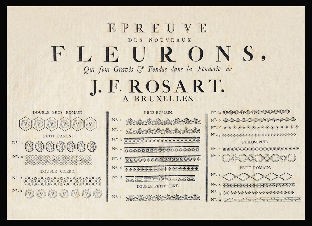
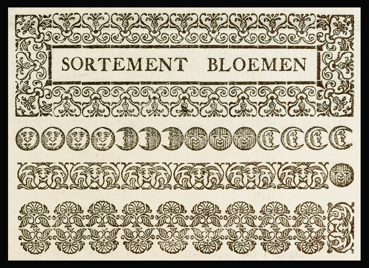
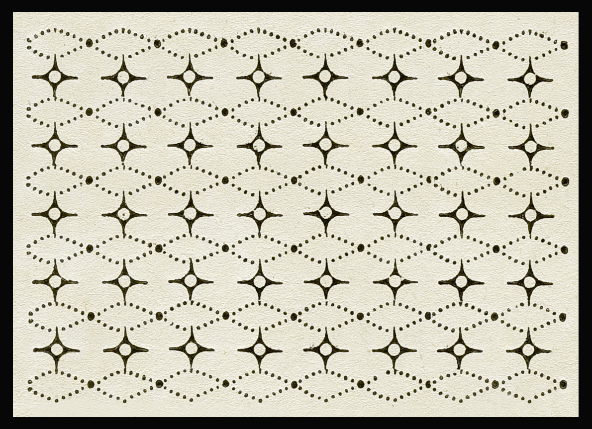
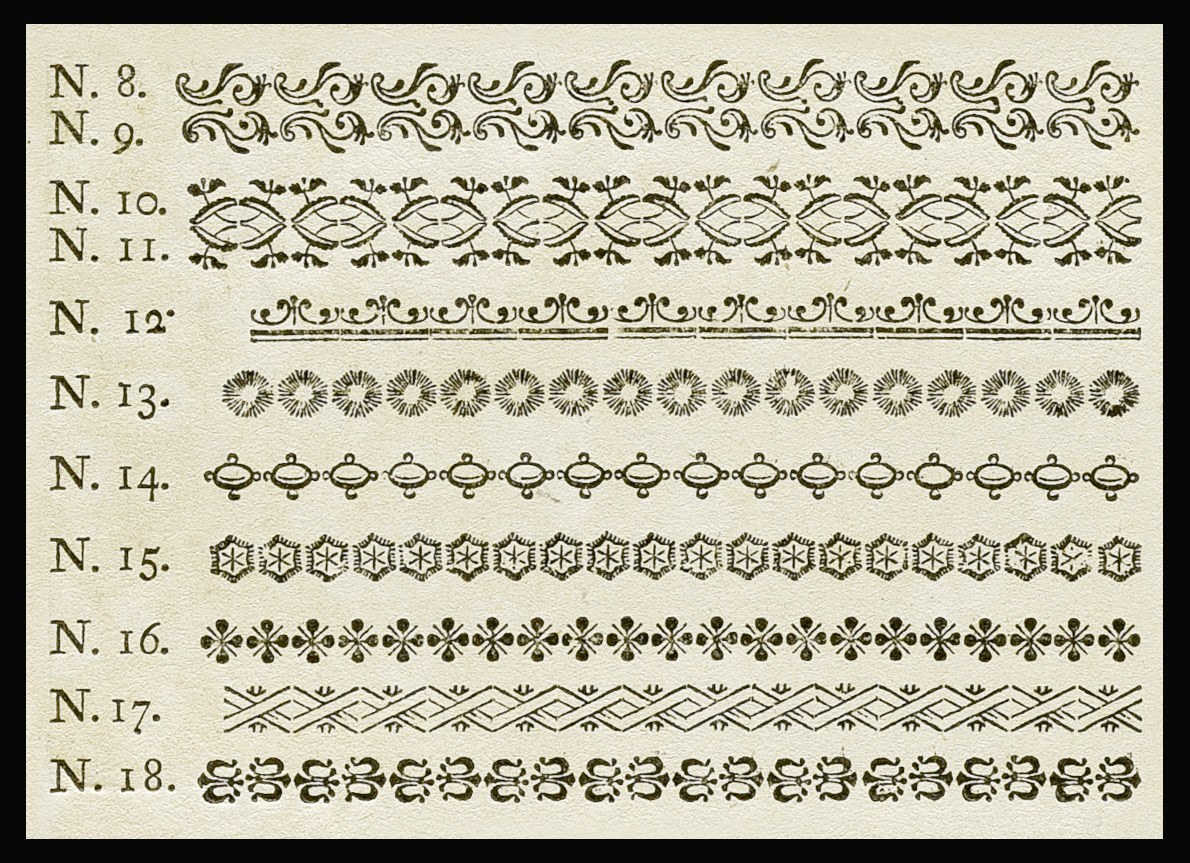
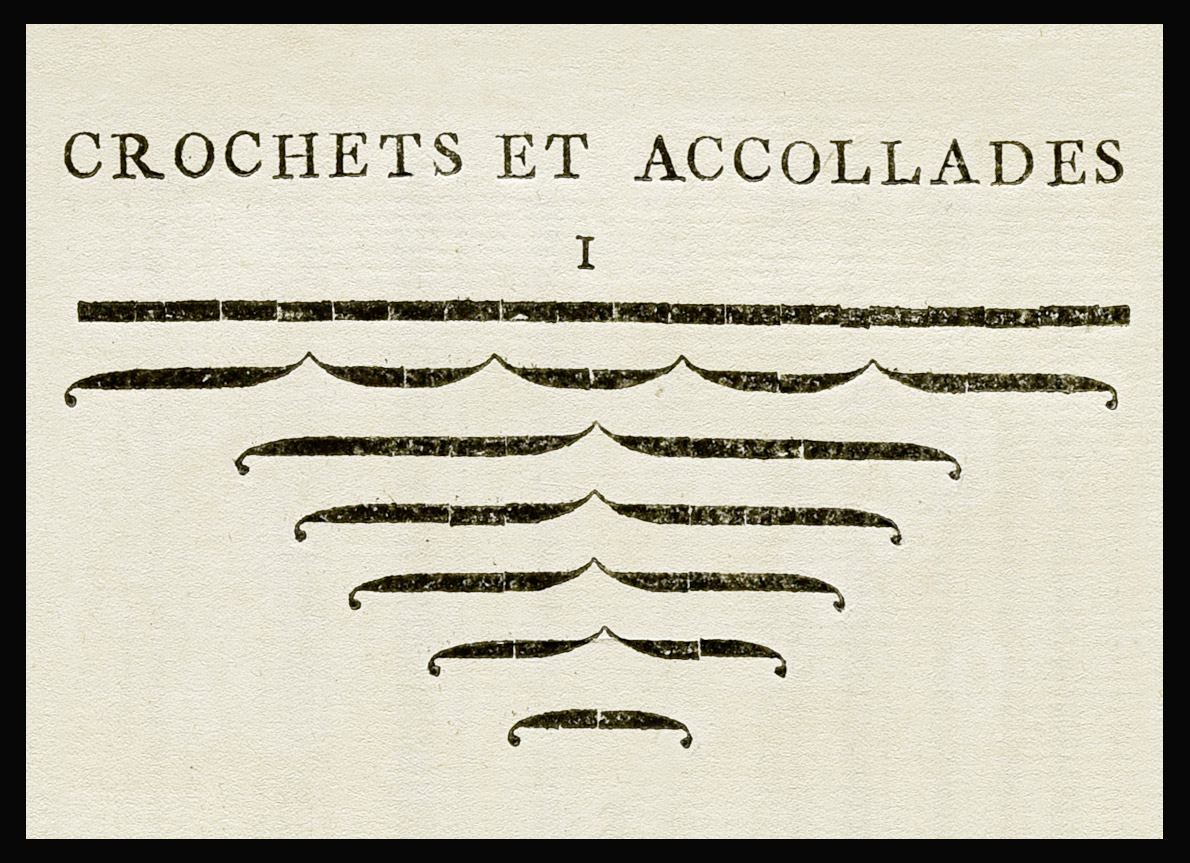
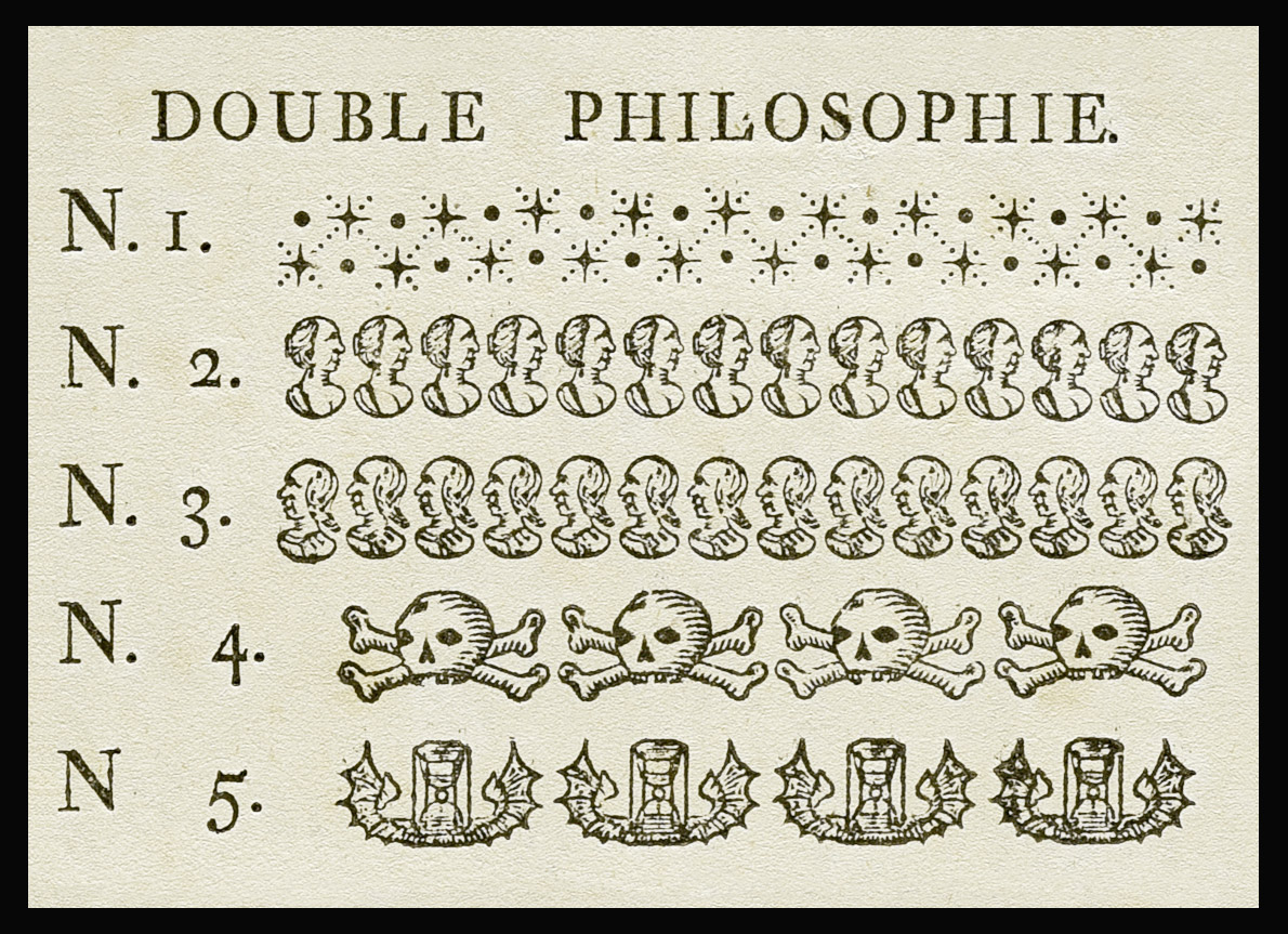
«The œuvre of Rosart also includes hundreds of ornaments and decorative elements.»
Michel started his research into source material in the Museum Plantin-Moretus for the extensive digital series of ornaments. He then found out that the type-foundry artifacts of the historical printing company Johan Enschedé have been preserved and are now archived at the aforementioned Noord-Hollands Archief. After his first visit, Michel was overwhelmed by the vast amount of historical material, such as the punches cut by Rosart, as well as printed type specimen and even related written documents from the 18th century.
Specimen of the new ornaments by Rosart, Brussels, published 1764.
Ornaments taken from the Epreuve des Carracteres Specimen. 1740.
Ornaments cut by Rosart, Specimen of the Widow Decellier, 1779.
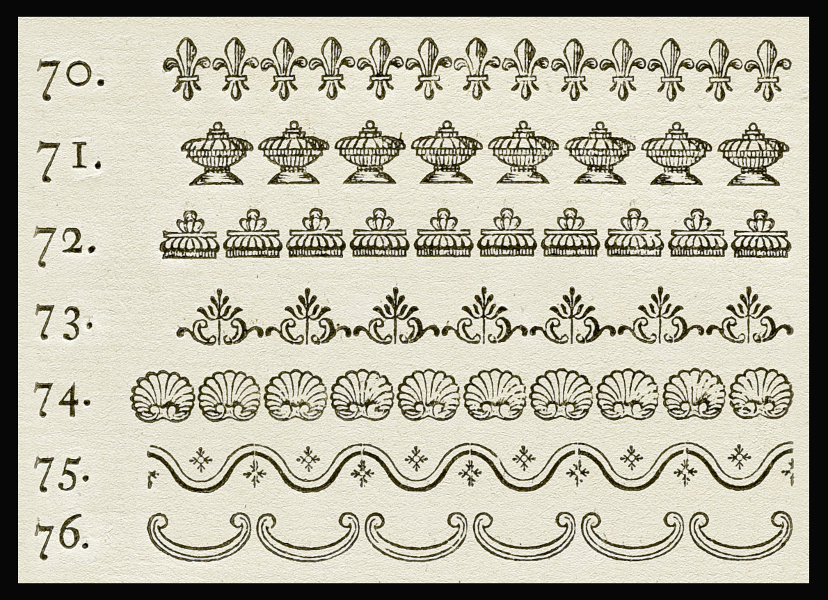
Ornaments cut by Rosart, Specimen of the Widow Decellier, 1779.
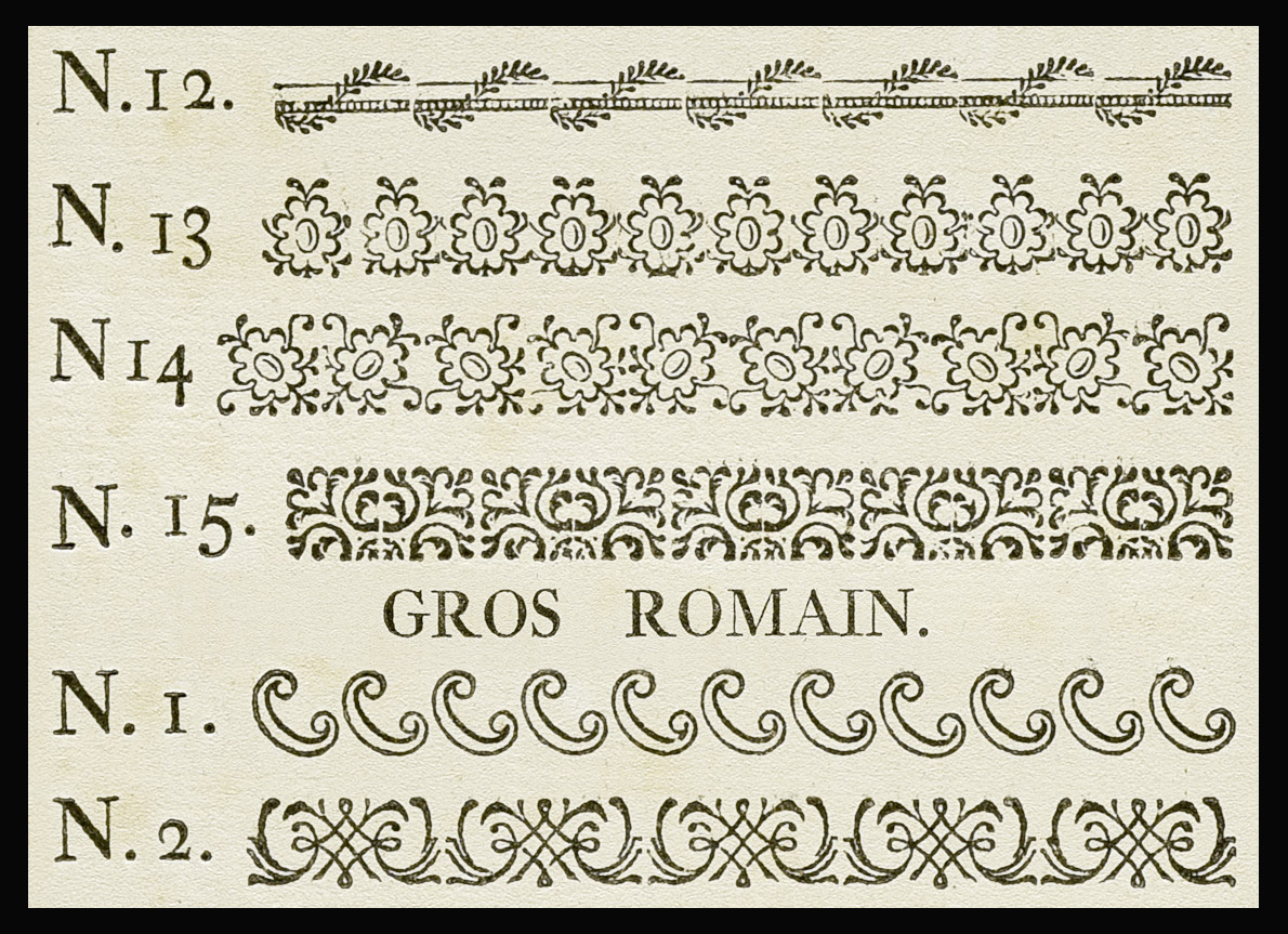
Ornaments cut by Rosart, Specimen of the Widow Decellier, 1779.
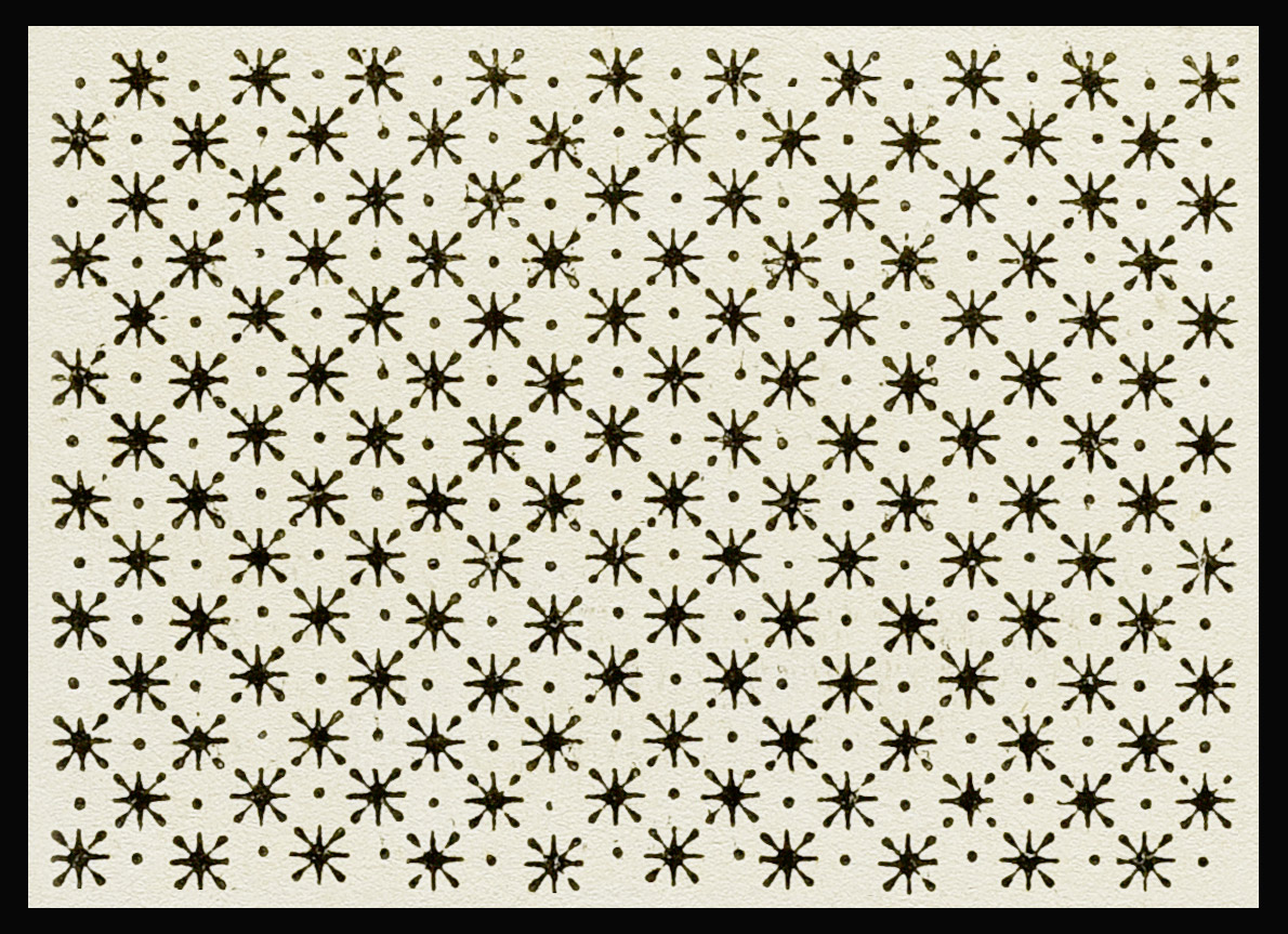
Ornaments cut by Rosart, Specimen of the Widow Decellier, 1779.
Ornaments cut by Rosart, Specimen of the Widow Decellier, 1779.
Ornaments cut by Rosart, Specimen of the Widow Decellier, 1779.
Ornaments cut by Rosart, Specimen of the Widow Decellier, 1779.
prev next To really touch and feel this material was a great experience: examining and photographing the punches that Rosart personally delivered was undeniably awe-inspiring. After collecting a lot of material, Michel started digitizing the first ornaments, strongly inspired by their beauty and detailed execution.
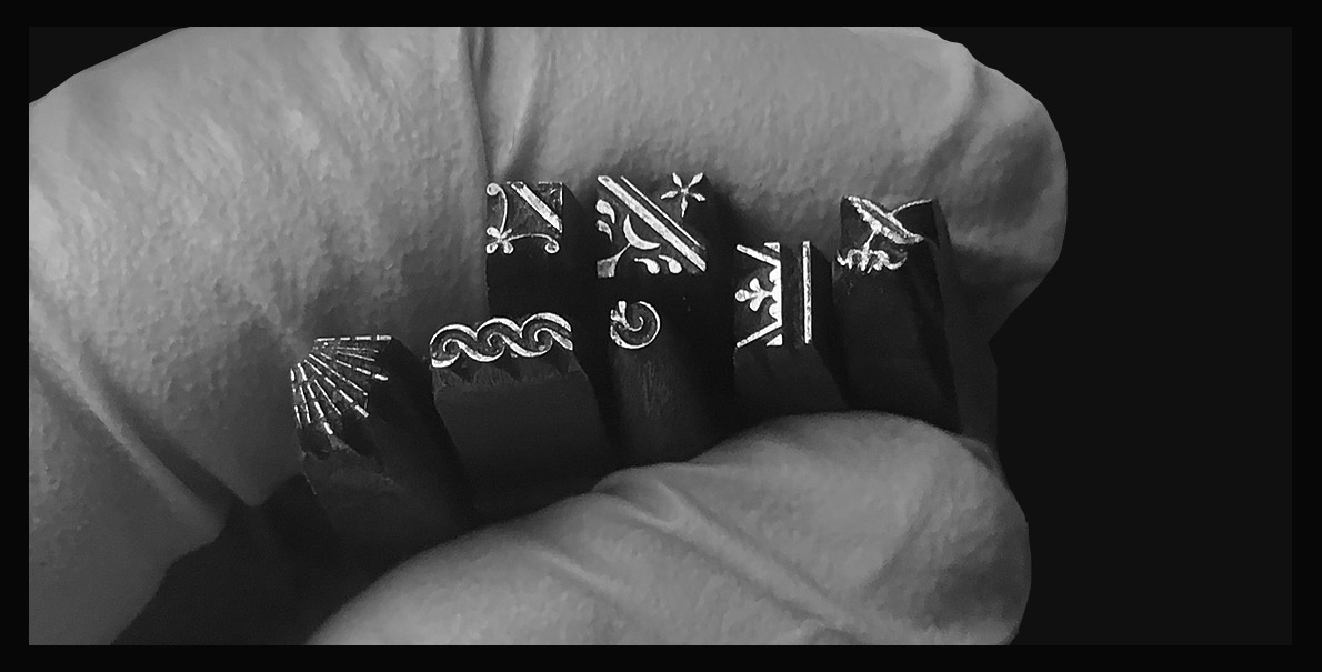
Original punches cut by Rosart for the Enschedé type foundry. Collection Enschedé. Photos: Michel Paré.
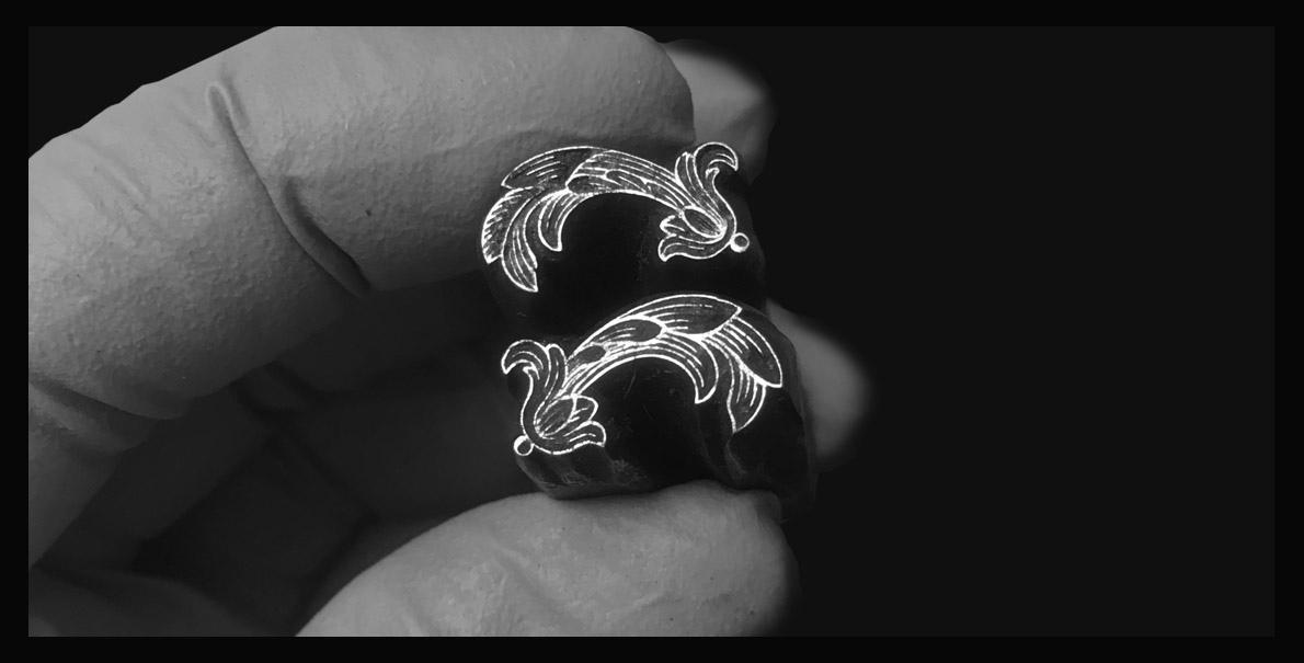
Original punches cut by Rosart for the Enschedé type foundry. Collection Enschedé. Photos: Michel Paré.
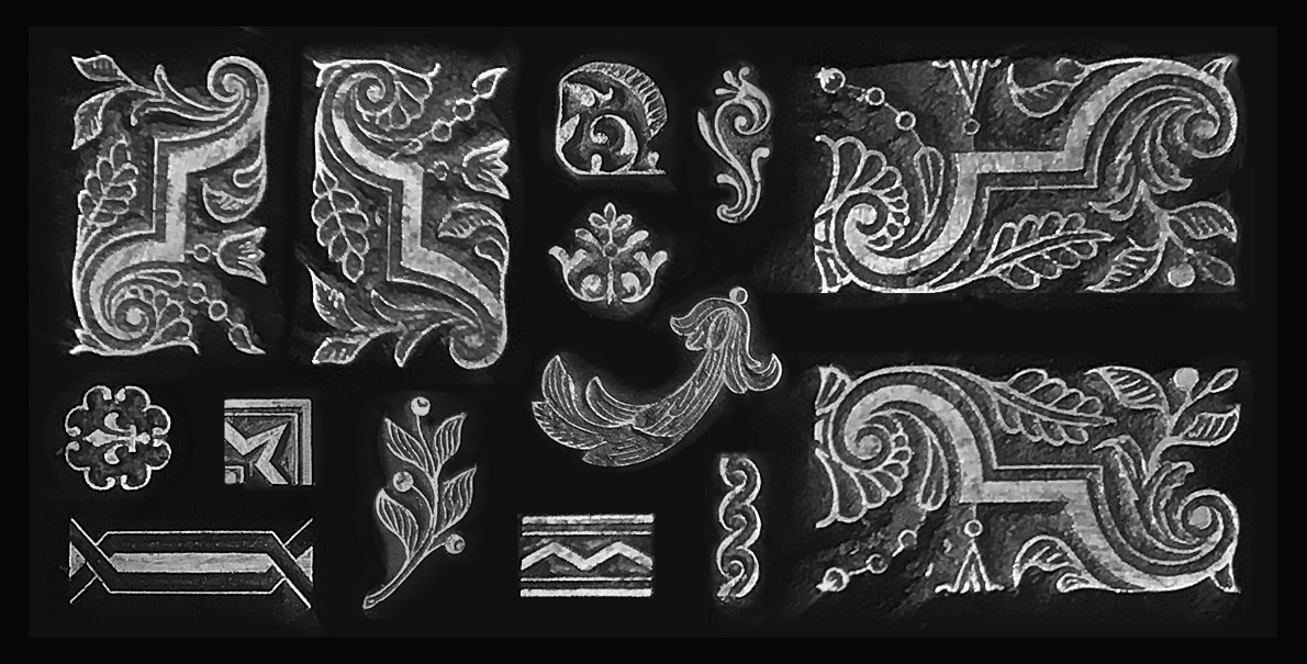
Original punches cut by Rosart for the Enschedé type foundry. Collection Enschedé. Photos: Michel Paré.
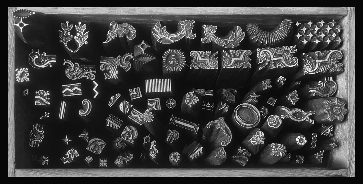
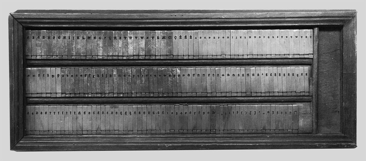
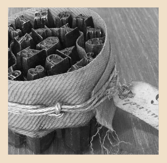
Box of punches cut by Rosart for the Enschedé type foundry. Collection Enschedé. Photos: Michel Paré.
prev next